Background
Expedia Group branded customer care support agents (located throughout Philippines, San Salvador, Egypt, North America) face the challenge of having to use different tools and applications (GDS, Classic Voyager, Voyager Flights, Eureka, Brand Site for Agents, etc.) to exchange customer flight bookings. On the Voyager Flights tool, agents have to manually determine penalty, change fee policy, and booking class rules which if done inaccurately lead to airline debit memos that adversely impact the business.
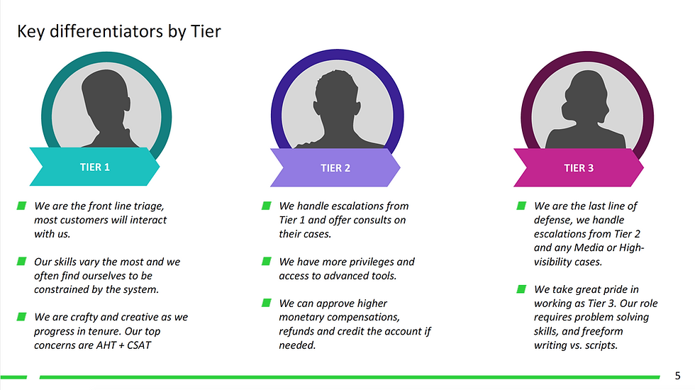
Incomprehensible system errors due to issues in downstream services and the inability to display information due to out of sync booking information when backend systems pull from different data stores also add to the pain points agents experience. When the agents don't know what their next step should be to resolve their customer's problems it leads to dissatisfaction. Tier 2 and Tier 3 agents have to memorize 15+ key commands for the different GDS systems they use to service flight bookings. There existed an opportunity to make a more user friendly interface that could quickly give the agents the information they need and reduce their average handling time.
Design Process
My Role
As the main designer on the project, I worked with the business owner, creative director, product managers, program managers, content strategist, testers, developers, service & delivery, and learning development teams to alleviate the customer pain points and improve the experience faced by the phone agents on complex flight exchange cases. I was a mentor to the designer working on customer self-service flight change. I drafted a design schedule for both our areas and reviewed the other designer's work. I designed around the constraints of an existing visual and interaction style guide and took into consideration the agent's current work flow for how they exchange flights in their current tool. I looked at their mental model for how other products were exchanged in the tool that I'd be building upon. I made design prioritization tradeoffs due to technical and resource limitations and followed design principles around simplicity, focus, clarity and efficiency in the user experience.
Customer Needs
• Improve user experience and increase user confidence. Make it easy and efficient for call center agents to service US and Canadian point of sale flight booking exchanges.
• Improve CSAT (customer satisfaction) for high volume and high effort calls.
• Reduce the customer effort required for 31% of flight exchanges
Business Goals
• Reduce operating costs and optimize the business by increasing the customer's ability to self-service.
• Reduce AHT (average handling time) and agent error costs.
• Reduce call propensity by at least 1% (target: 20%).
Understanding the user: Call Center Agents
When I interviewed and observed call agents at the different customer care centers, I saw they were on the phone with the customer an average of 5 to 15 minutes for simple cases and 30 minutes for complex ones. And, in extreme cases, like those due to weather related schedule changes, an agent could spend 1.5 hours on the phone with the customer and airlines. Customer call time increases for cases that need higher tier level agents/supervisors access and approval.

Call center agents are able to exchange flights for customers.
Call center agents are able to exchange flights for customers.
Design Planning
• Participated in Project Inceptions to gain a shared vision of business priorities, strategy and project scope from Product Management, Line of Business, Development, and additional cross-functional teams. Met with Learning & Development to understand agent workflows and flight exchange and cancel policies and Content Strategists on the Eureka Knowledge Base Tool that agents depend on.
• Drafted and presented design schedule to product management and development/test teams based on dev milestones and the scope of the project.
• Participated in working sessions with PM/DEV/TEST to discuss project scope and technical constraints. Group white boarding sessions to agree on user experience and user flow with shared understanding of data model, and business requirements.
• Created an html design index and Confluence page for the project that displayed the task flow diagrams and links to prototype, mockups deliverables, and redlines/annotations.
Understanding the problem space
Met with my PM/Business owner to gain more background on the flight business and strategy on why the project was important. I learned about the tools the agents use and training they go through.

Research
• Observed and interviewed call center agents to understand their workflow and escalation process for the different agent types: Tier 1, Tier 2, and Tier 3 (Complex Air Agents).
• Consulted with subject matter expert from the service delivery team and the line of business product managers on knowledge collected from past survey results and call center agent visits. The goal was to understand the issues that had the biggest impact on the business and the user experience pain points.
• Competitive analysis and heuristic evaluation of airline websites (United, Alaska, etc.).
• Task analysis and evaluation of the current user experience (Voyager Flights tool) that was being used to exchange, cancel, and void flights by Tier 1 agents in US/CANADA.
• Researched how the GDS is being used by Tier 2 agents and Complex Air agents.
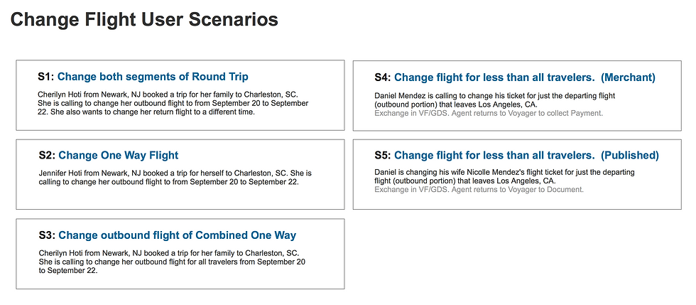
User Scenarios
Identified key scenarios and use cases. Created wireframe screens in Sketch. Built out multiple prototypes in Axure for usability testing.
User Task Flow Diagram
I delivered scenario flows for the different use cases and handed off design for the following screen deliverables: Select Flights/Travelers, Search, Search Results, Review, Confirmation, and confirmation email template. I contributed to the style guide by introducing a new layout pattern on the Review screen for displaying the amount due for a flight exchange.
For the customer self-service portion, I delivered on the review, checkout, and confirmation user experience and ensured the end to end self-service flow worked for responsive web.

Design Deliverables
Created an html index page for the designs. Planned for a design schedule that took into consideration the multiple design iterations with usability testing as well as feedback from reviews with business owners.


Drafted a schedule and worked with dev team on alignment of the design deliverable dates would work with the dev milestones.
Drafted a schedule and worked with dev team on alignment of the design deliverable dates would work with the dev milestones.
Focus Group Session
Agents prioritized most common used tasks they use in Voyager Flights.


Background
Expedia Group branded customer care support agents (located throughout Philippines, San Salvador, Egypt, North America) face the challenge of having to use different tools and applications (GDS, Classic Voyager, Voyager Flights, Eureka, Brand Site for Agents, etc.) to exchange customer flight bookings. On the Voyager Flights tool, agents have to manually determine penalty, change fee policy, and booking class rules which if done inaccurately lead to airline debit memos that adversely impact the business.
Incomprehensible system errors due to issues in downstream services and the inability to display information due to out of sync booking information when backend systems pull from different data stores also add to the pain points agents experience. When the agents don't know what their next step should be to resolve their customer's problems it leads to dissatisfaction. Tier 2 and Tier 3 agents have to memorize 15+ key commands for the different GDS systems they use to service flight bookings. There existed an opportunity to make a more user friendly interface that could quickly give the agents the information they need and reduce their average handling time.
Design Process
Smartsheet
Data & Security
Designed experiences for user admins to create governance control policies: data retention, data classification, and controls that limit the user sharing of data.

Overview
I use a design kick-off meeting with my Product Manager, Developers, SMEs, Design, and User Research. The output is a "Framing the Problem" document where we come together with a shared vision of the user needs, current experience pain points, and business goals. I connect with subject matter experts, business sales, account management, stakeholders and my design counterparts to identify overlaps, share knowledge, and gather inputs so that we can create a holistic experience that is frictionless with no dead ends. Together, we'll explore project vision and scope, what we know and what we want to find out, address milestones in the design schedule, and align on the success metrics we are trying to achieve.
Identify & Define
During the research phase, I created mini-personas based on customer interviews. I presented these to my working team to establish and ensure shared knowledge and understanding of the user. Members of my design team went on to use these in their design work and presentations to leadership.


Research & Define
In the working sessions, I share research audit of similar products in the market and known customer mental models and future trends that are in the space. It's important to understand customer needs and pain points. Current solutions and context to where our product is entering the market and what the baseline expectations are from the customer and differentiators that have value and would increase conversion.
Working Space

Competitive landscape

Empathize
I conduct design usability heuristics analysis as a group and individual sessions to understand what the focus of each page/point in the experience and the purpose it serves. Identify and align on the good experiences from subpar ones.
Brainstorm Working Sessions

User Journey Mapping
Following up on research findings and interviews with customers, I facilitate working sessions with PM/Dev/UX alongside with data compliance subject matter experts and cross-team collaboration with designers working on Search and Browse to understand customer needs, pain points, and opportunities to improve the experience.

Task flows
From the working team discussions and scenario narratives, I create mind maps and experience task flows. I make the collaboration space on a Miro Board. I explore different approaches and evaluate the problem from different angles. Looking at the entry points into the experience for the first time user, repeat user, and making sure the flow is connected with no dead ends and is effective. I make notes on what I want to know from customer (Example: number of policies and inclusion versus exclusion groups).

Decision Tree Diagrams

Mapping the Experience
From the research interviews and usability sessions, I created an experience map for the different governance controls we validated to communicate the user experience focus areas and help with feature prioritization.
Key findings were the need of multiple retention policies, different retention time periods and desire for exclusions within the inclusions groups. Also key was to honor the user need of awareness and visibility in items that were flagged by policy prior to being placed in the recycle bin

Mini-Proto Personas were used by other members of my design team for onboarding and as a point of reference and knowledge alignment.
Wireframe Iterations - Validation
Usability session were held with 7 customers. I presented the findings from the initial beta customer sessions to my product and development team. I also presented the recommendations on how we could make the experience better. My PM created Jira stories and scheduled updates into the roadmap. I iterated on my wireframes to explore the flow of adding data classification to the ability to create retention policies.
Key takeaways from Data Egress Policy Study sessions were that prevention of external collaborations from Publishing and Exporting were the most important capabilities to build out first.
A follow up to the usability session was an exploration of interaction patterns for Data Retention. What we currently use and how we can optimize it. Emerged with a new improved pattern with validation of the need for multiple retention policies and ability to take action to retain sheets in bulk. I interfaced with my Product Manager to evaluate feedback from PAC user group sessions that are held monthly for customer feedback on our launched products.

Final Mockups
From the wireframes and sketches, I created design mockups using our design libraries that were in Sketch. Our team transitioned to Figma. I shared my mockup iterations in Zeplin and Figma. I created prototypes both in Axure and Figma for the different usability sessions to validate designs. Approach to Governance Controls was a hub-spoke model. Principles of clarity, system status, and setting proper expectations for the IT Admin and the end-user Sheet Owners was important.


Outcomes
Final design and findings were presented to Senior Leadership and shared at Pillar reviews. Across several iterations and usability sessions, key data findings were presented to my working team. Data Retention phase 1 launched and provided a base level offering (file retention and multiple retention periods). Future phases based on data findings insights pointed to the need for more admin visibility into ownership and sharing of sheets and multiple retention policies. Work was foundational for future designs in Data Egress and Data Classification.
I created and circulated idea board for future project vision where we could flag sheets as a list in a Smartsheet file instead of having them be automatically moved and placed in the trash bin. These ideas inspire other ideas to post their own ideas that lead to new product features that improve the current experience that we can build into the product roadmap.

I also created a shared design doc for data classification to document design vision and approach. It was used to collect and align on feedback from cross-teams for user experience consideration points, resourcing, and design integration.
I hired a senior designer to work on the Governance Controls and had him create the UX deck and would move the project forward with designs for beta, mvp, and future phases leading up to north star vision.