Background
Expedia Group branded customer care support agents (located throughout Philippines, San Salvador, Egypt, North America) face the challenge of having to use different tools and applications (GDS, Classic Voyager, Voyager Flights, Eureka, Brand Site for Agents, etc.) to exchange customer flight bookings. On the Voyager Flights tool, agents have to manually determine penalty, change fee policy, and booking class rules which if done inaccurately lead to airline debit memos that adversely impact the business.
Incomprehensible system errors due to issues in downstream services and the inability to display information due to out of sync booking information when backend systems pull from different data stores also add to the pain points agents experience. When the agents don't know what their next step should be to resolve their customer's problems it leads to dissatisfaction. Tier 2 and Tier 3 agents have to memorize 15+ key commands for the different GDS systems they use to service flight bookings. There existed an opportunity to make a more user friendly interface that could quickly give the agents the information they need and reduce their average handling time.
Design Process
My Role
As the main designer on the project, I worked with the business owner, creative director, product managers, program managers, content strategist, testers, developers, service & delivery, and learning development teams to alleviate the customer pain points and improve the experience faced by the phone agents on complex flight exchange cases. I was a mentor to the designer working on customer self-service flight change. I drafted a design schedule for both our areas and reviewed the other designer's work. I designed around the constraints of an existing visual and interaction style guide and took into consideration the agent's current work flow for how they exchange flights in their current tool. I looked at their mental model for how other products were exchanged in the tool that I'd be building upon. I made design prioritization tradeoffs due to technical and resource limitations and followed design principles around simplicity, focus, clarity and efficiency in the user experience.
Customer Needs
• Improve user experience and increase user confidence. Make it easy and efficient for call center agents to service US and Canadian point of sale flight booking exchanges.
• Improve CSAT (customer satisfaction) for high volume and high effort calls.
• Reduce the customer effort required for 31% of flight exchanges
Business Goals
• Reduce operating costs and optimize the business by increasing the customer's ability to self-service.
• Reduce AHT (average handling time) and agent error costs.
• Reduce call propensity by at least 1% (target: 20%).
Understanding the user: Call Center Agents
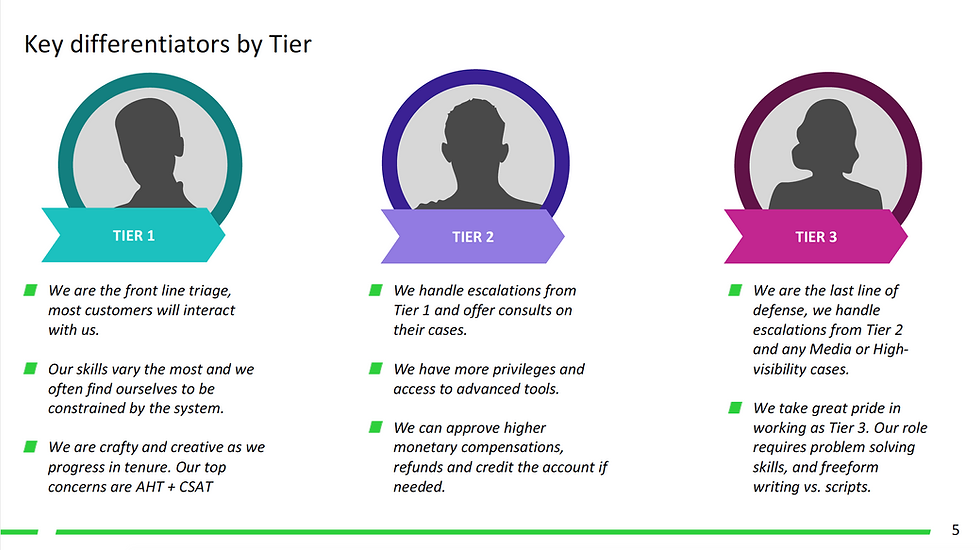
When I interviewed and observed call agents at the different customer care centers, I saw they were on the phone with the customer an average of 5 to 15 minutes for simple cases and 30 minutes for complex ones. And, in extreme cases, like those due to weather related schedule changes, an agent could spend 1.5 hours on the phone with the customer and airlines. Customer call time increases for cases that need higher tier level agents/supervisors access and approval.


Call center agents are able to exchange flights for customers.

Call center agents are able to exchange flights for customers.
Design Planning
• Participated in Project Inceptions to gain a shared vision of business priorities, strategy and project scope from Product Management, Line of Business, Development, and additional cross-functional teams. Met with Learning & Development to understand agent workflows and flight exchange and cancel policies and Content Strategists on the Eureka Knowledge Base Tool that agents depend on.
• Drafted and presented design schedule to product management and development/test teams based on dev milestones and the scope of the project.
• Participated in working sessions with PM/DEV/TEST to discuss project scope and technical constraints. Group white boarding sessions to agree on user experience and user flow with shared understanding of data model, and business requirements.
• Created an html design index and Confluence page for the project that displayed the task flow diagrams and links to prototype, mockups deliverables, and redlines/annotations.
Understanding the problem space
Met with my PM/Business owner to gain more background on the flight business and strategy on why the project was important. I learned about the tools the agents use and training they go through.


Research
• Observed and interviewed call center agents to understand their workflow and escalation process for the different agent types: Tier 1, Tier 2, and Tier 3 (Complex Air Agents).
• Consulted with subject matter expert from the service delivery team and the line of business product managers on knowledge collected from past survey results and call center agent visits. The goal was to understand the issues that had the biggest impact on the business and the user experience pain points.
• Competitive analysis and heuristic evaluation of airline websites (United, Alaska, etc.).
• Task analysis and evaluation of the current user experience (Voyager Flights tool) that was being used to exchange, cancel, and void flights by Tier 1 agents in US/CANADA.
• Researched how the GDS is being used by Tier 2 agents and Complex Air agents.
User Scenarios
Identified key scenarios and use cases. Created wireframe screens in Sketch. Built out multiple prototypes in Axure for usability testing.
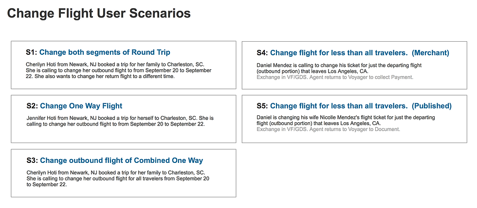

User Task Flow Diagram
I delivered scenario flows for the different use cases and handed off design for the following screen deliverables: Select Flights/Travelers, Search, Search Results, Review, Confirmation, and confirmation email template. I contributed to the style guide by introducing a new layout pattern on the Review screen for displaying the amount due for a flight exchange.
For the customer self-service portion, I delivered on the review, checkout, and confirmation user experience and ensured the end to end self-service flow worked for responsive web.


Design Deliverables
Created an html index page for the designs. Planned for a design schedule that took into consideration the multiple design iterations with usability testing as well as feedback from reviews with business owners.


Drafted a schedule and worked with dev team on alignment of the design deliverable dates would work with the dev milestones.

Drafted a schedule and worked with dev team on alignment of the design deliverable dates would work with the dev milestones.
Focus Group Session
Agents prioritized most common used tasks they use in Voyager Flights.


Background
Expedia Group branded customer care support agents (located throughout Philippines, San Salvador, Egypt, North America) face the challenge of having to use different tools and applications (GDS, Classic Voyager, Voyager Flights, Eureka, Brand Site for Agents, etc.) to exchange customer flight bookings. On the Voyager Flights tool, agents have to manually determine penalty, change fee policy, and booking class rules which if done inaccurately lead to airline debit memos that adversely impact the business.
Incomprehensible system errors due to issues in downstream services and the inability to display information due to out of sync booking information when backend systems pull from different data stores also add to the pain points agents experience. When the agents don't know what their next step should be to resolve their customer's problems it leads to dissatisfaction. Tier 2 and Tier 3 agents have to memorize 15+ key commands for the different GDS systems they use to service flight bookings. There existed an opportunity to make a more user friendly interface that could quickly give the agents the information they need and reduce their average handling time.
Design Process
Travel Connect
Travel Connect is a platform for internal and external partners to grow their travel business.
The MVP deliverable was a website and a set of APIs that would allow the internal Expedia Brand manager/technical program manager the ability to setup a new point of sale in another country 75% faster than before.

My Role
As the lead designer for MVP launch, I helped drive design strategy, project vision, scope, and deliverables with product directors, project manager, creative director, content writer, backend architect and developers from different cross-functional teams. I collaborated with 2 other designers for style guide patterns and illustration needs. I presented and reviewed designs with business owners and upper level management and conducted multiple iterative usability studies (10+ participants).
I created a design schedule that covered both the concept iteration and research phases of the project as well as the tactical phase when we moved into sprints that aligned with dev implementation. There were several design iterations with feature trade-offs due to backend and timeline constraints. I worked with 8 developers, 3 content writers, and a project manager in two week agile sprints where I delivered final mockups, redlines and reviewed builds and prioritized bugs.
Business Goals & Customer Needs
-- Simplify the experience and lessen the amount of time it takes for an internal brand manager to setup and launch the new website. Current point of sale setup and launch experience can take anywhere from 6 weeks to 6 months.
-- Target goal was a scalable platform that delivered efficient and effective speed in task completion, accuracy of entered data, and success in submitting a POS project request. Current process is complicated and time intensive. The customer has to contact 4-6 people from different teams to get the work done. Several Jira support tickets which contain redundant information are created.
-- We wanted our customers to feel the experience would be: Efficient, Simple, Responsive, Intuitive, and Fast.
Design Process
To accelerate the design and development for the initial product launch, I partnered with my product manager and held two design workshops. The project was part of the company's transformation initiative and because it touched a lot of different people and effected their tools and workflows, there were a lot of unknowns and open questions.
The first workshop allowed the cross-company stakeholders (members from payments, fraud detection, inventory, product strategy, development, and design) to align on project goals. It helped identify target user and journeys that would be supported for the initial launch but gave us an understanding of the partner landscape and identified open questions. The 2-day session ended with a readout deck that we created and presented to leadership and shared out to the broader group.
The second workshop allowed us to drill deeper on the user stories and the requirements for the target user and make sure that all cross-discipline team members (pm, dev, design, content) had the same understanding of project scope, business and dev requirements, and design principles. It then allowed us as a team to ideate on the user tasks and experience flows. The second workshop was a 1-week design sprint with multiple rounds of customer interviews and a usability read-out at the end.
Outputs from the two workshops had impact in helping inform the third workshop that pulled in more teams and stakeholders across the company to build out roadmap, dependencies, and align on terminology. The Travel Connect project team was one of the three Transformation Teams leading the company-wide initiative of building out the foundations of the platform in 2018.

Research
• Conducted competitive research on platform websites (Shopify, AWS, Google, and Expedia partner sites) to gain a better understanding for b2b service experiences.
• Interviewed SME: Product Manager of Customer Agent Support Group (sets up the POS behind the scenes) to learn more about the different partnerships types, current work flow, people and tools used.
• Interviewed SME: Brand Manager and Internal Technical PM (requestors for POS to be setup) for current experience, pain points, and to get a better understanding on how they work with each other on the point of sale launch.
• Interviewed SME from different Expedia Group brands and observed workflow and setup requirements to identify any similarities and differences that the user interface would need to accommodate.


Design Approach
• Partnered with my project manager and facilitated Design Workshop 1 (10 attendees - cross-functional stakeholders) to create user personas, information architecture, user stories, and task flows.
• We collaborated again on Design Workshop 2 (20 attendees - cross-discipline working team) and modeled it after a Google design sprints with a prototype that we tested with 6+ participants at the end of the week.

• Presented design insights and usability research from Design workshops 1 and 2 at Design workshop 3 (30 attendees - cross-functional team org representatives) in partnership with my PM from Product Strategy and the PM from Payment. Workshop 3 was focused on identifying current workflows that could be optimized, business requirements that need to be considered and planning for future product offerings to external partners.



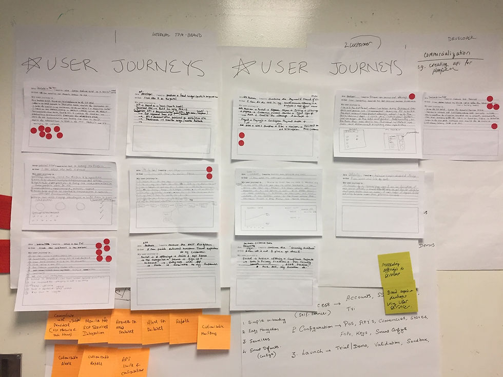
User Scenarios
In order to organize our approach, Working off user stories, I created a user journey template that workshop attendees used to brainstorm user experiences. I then facilitated the session of having attendees share, assess, and prioritize the different user journeys they came up with. The team was able to vote and agree on which journeys where most important to pursue first.


Design Working Sessions & UX Reviews
• In order to save us time, prevent misunderstandings, and agree on the user experience, I held whiteboard sessions and design reviews for site architecture and task flows with working team members (PM, Dev, Test, Content, Design).
• There were design and pm teams in Bellevue, London, and India that were working on partner and access management design projects. I wanted to make sure the flows between overlapping areas made sense so I held weekly design syncs so that we could review designs and use the same common controls and page patterns in our wireframes/mockups.
• During buddy testing with my developer, I learned that the existing css html code was not updated to the most recent design styleguide changes and wouldn't be finished in time for my dev team to use for launch. I held strategy sessions between design and developers on my team and the central developer team on the approach for utilizing the shared .css styles and ui toolkit. The temporary styleguide that we created as an override needed to be scalable to future adjustments once the existing styleguide was finished. The central dev team needed to know what gaps existed in the current styleguide so that they could plan out timeline for fixes.


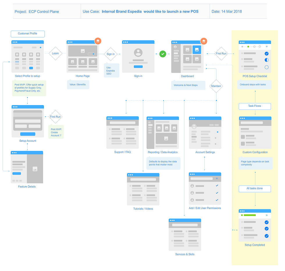
User Task Flow Diagram
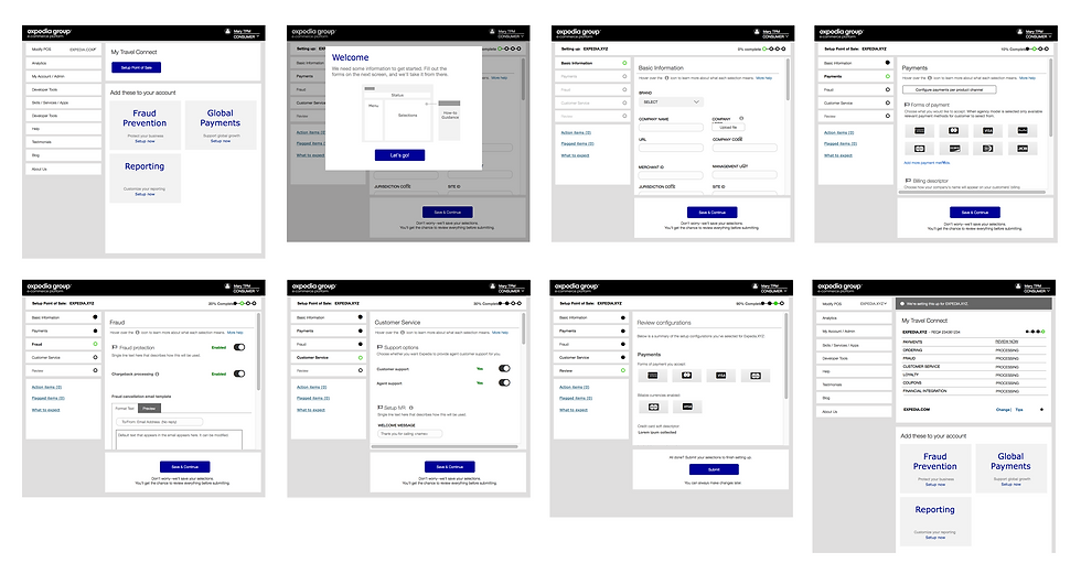
• Based on the key scenarios and use cases our team identified, I created wireframe screens in Sketch and built out prototypes in Axure for usability testing. The task flow diagrams supported the user stories.

Wireframe Prototype Flows
After the white boarding sessions and diagrams, I created a grey box prototype click-thru that we used in usability testing to validate and test assumptions. Worked with my content strategist on the text verbiage and my product manager on the required data fields.
Describe your image

Describe your image
Usability Testing
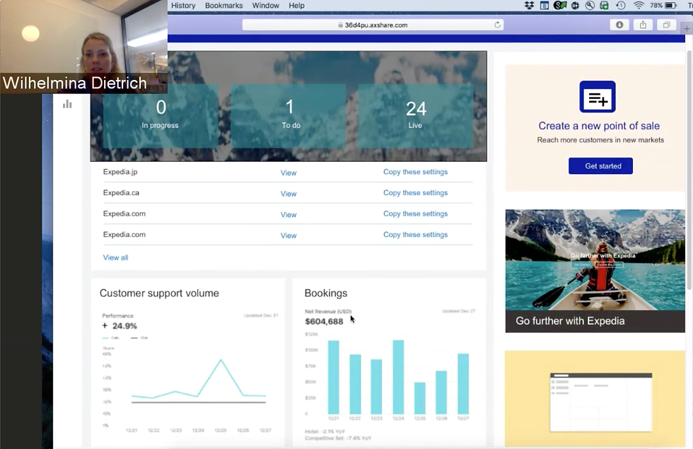
• During Design workshop 2, I created wireframe screens in Sketch and built out multiple prototypes in Axure.
• Based on test brief of what we wanted to find out. I created usability test script and conducted usability testing both in-person and remotely (remote testing was done with participants in London and Malaysia).
• I educated and evangelized cross-functional team members on the usability test script and observation best practices so that they could run customer interview sessions as well so that we could gather more data faster.
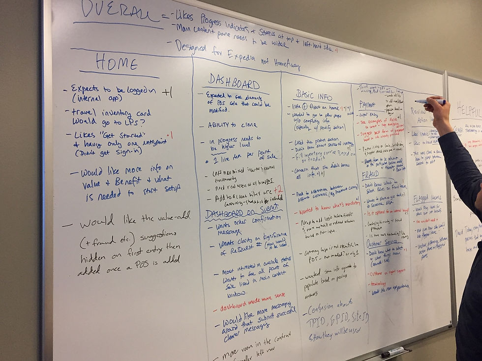
• I presented our team's overall usability test findings to the working group.
• After the design workshops, more iterative usability sessions were held with three participants.
Describe your image

Describe your image



Final Designs
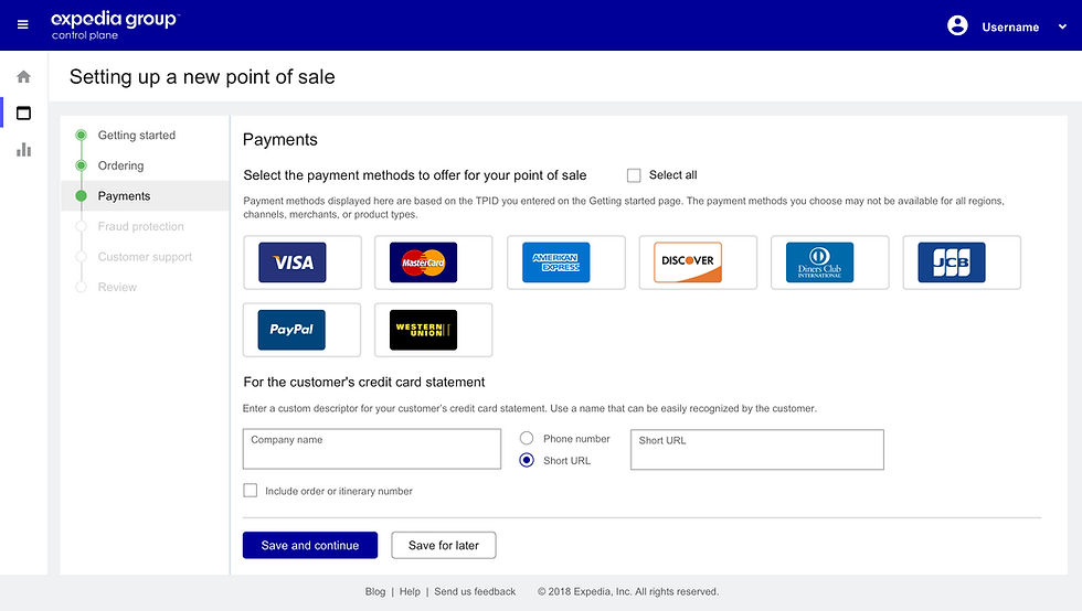
• Delivered final mockups, prototype, and annotated redlines for the home page dashboard, setup Point of Sale workflow, and the Projects page. Example of deliverables for a designed screen:


• Participated in sprint story planning and user story writing sessions with PM, Content, Dev and Test.
• Deliverables were agreed on and planned out in 2 week cycles for the next three months.
• Daily standup meetings with dev team to answer design questions or adjust designs based on backend issues and time constraints.
Design Development
Technical scope & development constraints that came up for the initial product launch:
-- Once setup request was submitted, customer would not be able to self-serve and edit form content.
-- Not able to provide exact percentage rate to setup completion. Simplified experience to three status states.
-- Not able to display Summary information within the Travel Connect website. Link was provided to another website.
-- Sign-in had to be done via an internal account tool instead of Single Sign-on ADFS.
-- Web toolkit was incomplete. Separate .css file was created that could be overwritten once toolkit was updated.
These were identified as fast follow-ups post launch.
Design Fit & Finish
Daily standup meetings that covered:
• Buddy-testing meetings and side-by-side review of coded designs with developers.
• Participated in build reviews and bug prioritization meetings with PM, Dev, and Test.
• Partnered with pm/dev/test to determine process and severity levels for filed bugs.

Future Design Thinking
• In partnership with my product team, I presented the project and shared design approach at eCP annual offsite meeting.
• Provided design thought leadership for the next phase of the project. Designed experience flow and screens that appeared in the vision deck for the first partner service offering that will be marketed. The deck was used by product strategy directors to present in the leadership review meetings for 2019 planning.

